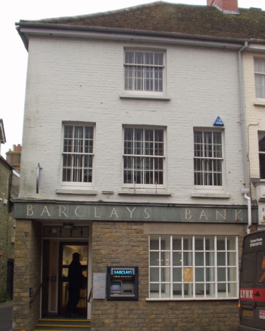
A significant win
Members may remember back in January 2012 when the Holt Society raised objections to a planning application by Barclays Bank which involved significantly increased size external signage and illumination. The application was part of a branch modernisation programme. We later learned that Holt Town Council had also objected to the plans but these concerns were not communicated to the applicant.
The result being that in Spring 2012 the Holt branch was given huge lettering and illuminated logos (larger than in Norwich branches!) which totally dominated the historic High Street. A sorry situation and all the worse because Barclays has a good track record elsewhere in the UK for adapting its signage to the scale, design and context of buildings. The Holt Society decided to contact Barclays HQ direct and present the case that Holt deserved better. At the time it seemed a long-shot because the damage was already done, and the building itself is not a fine one.
Design decisions for such projects are usually taken at corporate HQ level. In this case, the Holt branch of Barclays is a mediocre 1970s building which would not receive planning permission today. But whereas the building itself is not significant, the context is all important. It stands in a prominent position in Holt's Georgian High Street and conservation area. The context would not necessarily be self-evident to a third party working from a photograph at a distance. The Holt Society contacted Barclays in London and were put in touch with Irene East, Head of Corporate Affairs for the Eastern Region. Fortunately she is based in Norfolk and knows and cares about Holt, but we were dealing with a fait accompli in this case. She explained that Barclays would always take serious account of a local conservation society's objections had they known at the time.
We decided to try one more time (and it all takes a lot of time!) We wrote a detailed letter to Barclays outlining our objections, noting their sensitive treatment elsewhere, and asking whether they would consider taking a proactive measure to reduce the size of the signage in respect of the Georgian High Street. We enclosed copies of our publications, First Impressions and Good Design is Good Business.
What happened next is a tribute to the power of 'individuals who care'. The case was taken up by Ms East, liaising with staff at Barclays HQ in London to achieve a better design solution for Holt. The result - a few weeks ago the signage was replaced with a smaller scale version. Barely perceptible at first, but the change in proportion has made a significant difference when viewing from both ends of the High Street. It isn't ideal in that the illumination remains, but who knows, one day this too may be switched off at night to set an example to other corporate business premises in the town! And so, congratulations to Barclays for taking a lead when they were not legally obliged to do so.
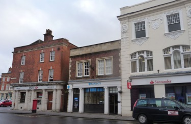
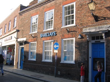
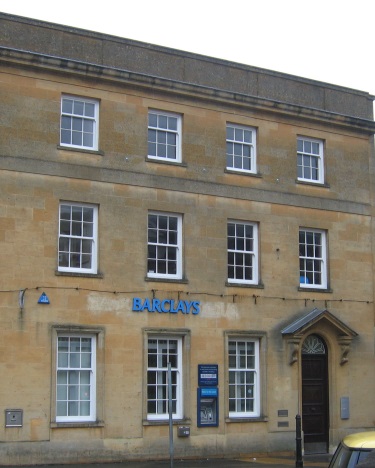
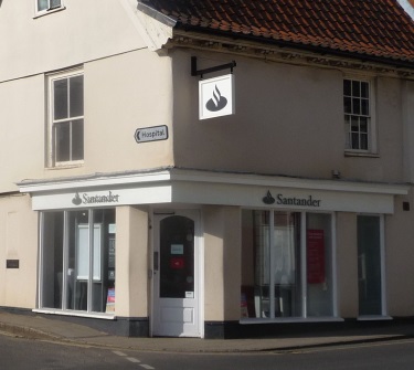
The photos below indicate the different treatments of corporate logos (symbols) and lettering. Many people don't realise that companies - whether banks, chain stores or restaurants - often adapt their signage to context, especially when the local council's planning department is vigilant and a conservation society is proactive. We have started a photographic archive to demonstrate these adaptations and hopefully to increase public awareness that Holt need not accept a 'one-size-fits-all' approach.
 |
 |
|
| Devizes, Wiltshire | Rye, East Sussex | |
 |
 |
|
| Stow-on-the-Wold, Gloucs | Shaftesbury, Dorset |
 |
||
| Santander, Aylsham - very different to Holt! |